
Activity 2
1. Read 2. Watch
|
Spreadsheets make great graphs! Graphs make it easier for people to understand data because they can see them. You have studied graphs since kindergarten and know that there are different types of graphs. Since our weather data is over a period of twelve months, what would be the correct graph to use?
Watch the video to find out what to do next! If you are using Microsoft Excel, watch the whole video--your directions are at the end. 3. doOpen the spreadsheet that you created on the average daily temperatures of four cities. If you did not complete it or did not start it. go back to Activity 1.
Create a line graph that shows the changing temperature over time of the four cities. Make sure you do the following:
|
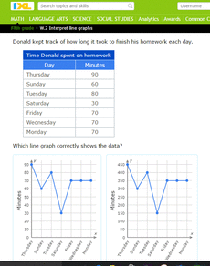
4. All done?How much do you know about line graphs? Test your knowledge by clicking on the picture below.
|
|
**If you are using Microsoft Word, go to File-->Download As-->Microsoft Word after you have opened the file. When it opens, click on the Enable Editing button at the top.
|